Blog > In Praise Of British Design
Newsletter: In Praise Of British Design

Roger and I were watching a brief video of a couple of DIYers working on their home, a time lapse of their projects set to music. The wall color: bold. The stair runner: wild. The art: eclectic. We had yet to hear them speak on camera.
"I bet they're British," I said.
"Gotta be," he responded.
We swiped to the next short video with them talking. Yep, British.
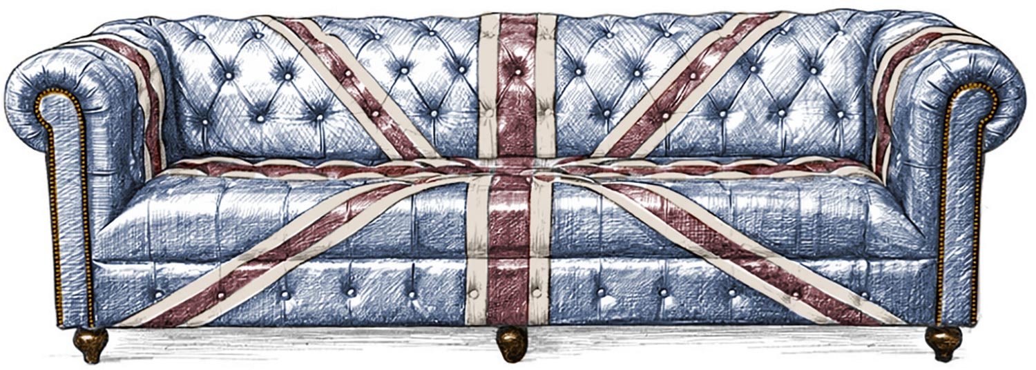
We're drawn like moths to the flame to the design work coming out of the UK. Not ultra-high end design projects. Not massive renovations of stately manors or city penthouses. Just the work of normal people with day jobs, small homes, and a lot of creativity.
Why does so much impactful design come out of the UK, and what are the reasons for the difference between what we see more commonly in the US?
It turns out there are some very real explanations for the disparity between British and American home design. British residential interiors genuinely do exhibit more layering, color, and character than typical American interiors, and much of this is attributable to differences in the houses, culture, and psychology.
Britain lives in older buildings
A larger percentage of the housing stock dates from Georgian, Victorian, and Edwardian eras. That means irregularly-shaped rooms, variances in ceiling heights, fewer perfectly-straight walls, and limited natural light.
Stronger colors and patterns, wallpaper, and an abundance of layered textiles came about partly as solutions to decorating these older residences. Darker paint can disguise uneven plaster, patterns counterweight asymmetry, and heavy use of textiles warms up interiors on grey days.
American homes, a larger percentage of which date to the mid-1900s and later — are more spacious and more uniform. Expanses of drywall and open plans can lend themselves to more neutral palettes. Both Brits and Americans are using decor to compensate for or accentuate their architecture; we just have different interior environments in which we're operating.
Climate impacts the psychology behind color
Britain is famous for more frequently overcast skies, resulting in softened daylight that is less contrasty. Colors like deep greens, bold reds, and saturated blues infuse a space with warmth and coziness, and cut out the flat coldness of the grey.
American homes, particularly as the nation has grown south and west, feature larger windows that draw in strong sunlight. Our homes can have the opposite extreme of too little light — an abundance of it. In such homes, people may feel that heavier, more saturated colors would read as too intense, leading many to favor whites, beiges, and greys.
Smaller spaces call for decoration
When space is limited, one might decorate more "fully" — walls, floors, ceilings all become surfaces upon which to play. The intimacy of rooms allows for more assertive mixing of patterns and finishes with less risk of creating "chaos." Yes, the combinations may be strong or even busy, but with more traditionally-defined rooms that are smaller to boot, it's more about concentrated impact. Think of an espresso — strong, but small.
American homes are comparatively much larger with less-clearly delineated layouts. Open concept floor plans wipe away "stopping points" and introduce longer sight lines, with everything on display at once. Bold patterns that may play well in a compact London flat can become overwhelming in a larger, interconnected space. Here, neutrals are easier to utilize. They aren't required, they're just easier. Think of an extra large iced latte. Bigger. Milder. And, appropriately enough, beige.
Collection versus coordination
In terms of our approach to decorating, Americans tend to tackle the design of a room in one go, while Brits are far more likely to let a room grow into its own over years or decades. This can increase the personalization of a space and make for a more meaningful visual story.
American interiors trend towards matched sets and tidily complementary finishes. We've arrived at this approach in part due to being trained by retailers and design publications. Tightly-coordinated decor, we've been told, represents polish and sophistication, and to get everything to match perfectly, you often have to do the whole room at once.
British design culture emphasizes gradual accumulation and riffing, with an expectation that, rather than "catalog perfect," a home look evolved, personal, and a little eccentric. The mixing of eras and styles is the norm, pairing Victorian and modern elements, distinct styles of furniture and patterns, and bolder, more varied artwork.
Designing for living versus designing for selling
This is one of the biggest influences on American home design. Americans homeowners are frequently fixated on resale value. They can be terrified of stepping too far outside of the beige box, lest they "destroy" the value of their home. And they have been conditioned to believe that, by making just the right decisions in their decorating and renovation projects, they can somehow unlock a cheat code and create a home that never goes out of style or down in value.
The end result is people who live in a home decorated not for their own joy but for the approval of a hypothetical future buyer. You could argue that this has significantly dampened the spirit of American design culture and pushed people away from what they actually want for their home.
British homeowners historically move with lower frequency and take more time with their renovations, which results in interiors that lean towards personalization instead of what is considered "market-safe."
Consumers are led by what retailers normalize
There is tremendous difference between the retail ecosystems in Britain and the US. Leading decor brands in the UK, like Farrow & Ball and House of Hackney lean hard into color, pattern, and personality. The mass retailers in the US generally trend in the opposite direction. Tonal palettes, muted upholstery, inoffensive artwork, and seven thousand different version of "off white." If you walk into a restaurant and everything on the menu has grilled chicken in it...you're probably going to be eating grilled chicken.
If, in contrast, even big brands push eccentric color pairings, non-traditional pattern combinations, and eclectic art, "bold" doesn't feel like a wild departure from the norm — it becomes the norm. If everything on the menu is served with a side of wasabi...you're gonna be eating wasabi.

Is it time for American tastes to become bolder?
We're certainly betting on it, and I think there are indications that they already are. Sophisticated design in the US has been trending towards higher impact choices for some time and that seems to be gaining traction with a broader set of the population. People are slowly shaking off the impulse to march lockstep with what they see on TV (partly because they're getting less of their design inspiration from mass-market media, replaced by a more diverse set of content creators). The Internet has democratized access to more specialized purveyors of home goods and decor (Hi. That's us. Glad you're here.) Maybe people are hungry for more personalized houses.
We certainly want to nudge people to build up some courage, discover the styles that bring them happiness rather than mollify a hypothetical homebuyer from six years in the future, and treat home design as something that evolves with you instead of task to be completed with the utmost urgency.
While there are legitimate reasons that American homes and their needs differ from what we see across the Atlantic, there are great lessons to be drawn from their approach to design and what it means to create a truly personalized home.

RELATED POSTS
Newsletter: On The Color Of Light
What's The Best Sofa If You Have High Ceilings?